Bon Voyage ! 網頁開發之路


Beginning of the Journey in 5xRuby Inc.
About my Internship Experience in 5xRuby (Five Times Ruby ❤)
About Me
Hello, I’m Maxwell, currently a 3rd grade Electrical Engineering student in Taipei, Taiwan. However, I love web development and self-learned for about a year and a half. I have created my website and develop several side-projects, you can view my GitHub to see what I’ve created ❤
哈囉~我是 Maxwell,目前就讀臺科大電機系大三的學生,然而我喜歡的是開發網站以及程式設計。我大約有自學差不多一年半的經驗,我也創建了屬於自我風格的部落格,也擁有額外軟體方面的小專案,大部分都是有了想法之後試著實現完成的,也因此可以藉由這些經驗學習到程式碼運作以及設計原理。你可以去我的 GitHub 上看到我玩過什麼東西~
Before learning code, when I see I can change the view of the browser with just simple HTML and CSS, I suddenly felt surprised and dived into the world of web development. I remember my first web project is a simple blog developed by Ruby on Rails and I can feel the joy when coding in Ruby.
在我學習編程之前,只是因為一些簡簡單單的 HTML 以及 CSS 的程式碼就讓我看到瀏覽器上神奇的改變,讓我(受到驚嚇並且)從此以後進入網站開發的領域。我還記得第一個開發的小專案是藉由 Ruby on Rails 做出來的簡易的部落格,而且我也可以感覺得到使用 Ruby 編程時的樂趣~
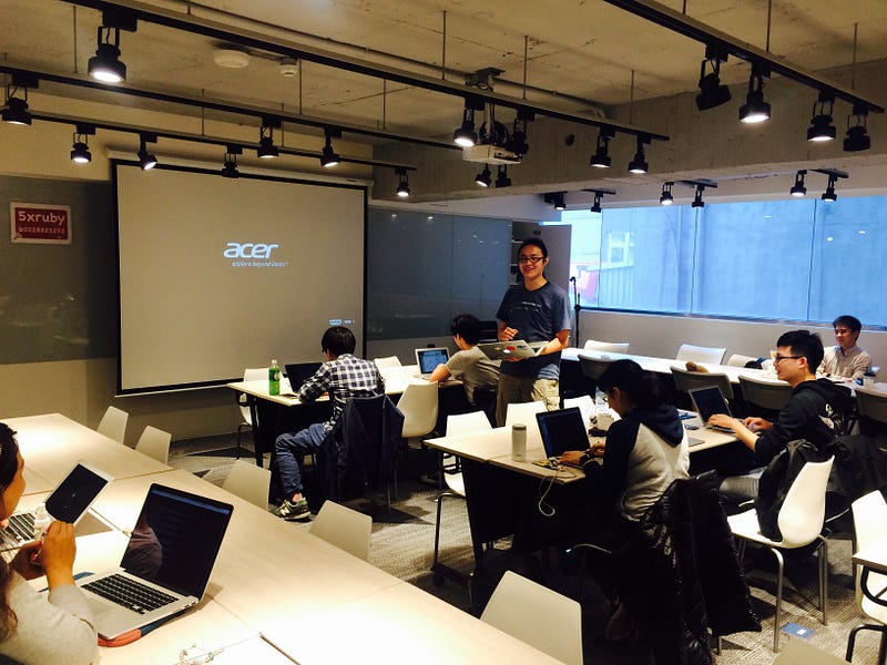
 (Photo by 五倍紅寶石出礦坑 Facebook Fan Page)
About 5xRuby
5xRuby is a company which established by a group of passionate Rubyist from Ruby Taiwan group. Their aim is to promote Ruby Programming Language and spread the happiness of using Ruby. They have held many kind of events and lectures such as Rails Girls events, Taiwan Ruby Conf. and many web development course.
五倍紅寶石是一間由來自 Ruby Taiwan 社群熱忱的開發者創立的公司,宗旨是推廣 Ruby 這個優雅的程式語言並且分享藉由 Ruby 開發過程中的快樂。它們也舉辦了多場不同的活動與課程包含 Rails Girls,Taiwan Ruby Conf. 以及各種網路相關開發的課程。
Internship in 5xRuby
5xRuby is not only well-known among Taiwan Ruby developers but also in Japan and the other countries. It is my best chance to succeed in my career by joining the internship in 5xRuby. I used to think that I have lots of things to learn in CS due to less experience in programming. Nowadays, sometimes I still struggled a lot for understanding and learning to program,
The reason why I can persistently to learn what I am learning is because I am in love with what I am doing.
I am clear that I want to build web applications, playing around with UI design and fancy CS technologies. 5xRuby offers the internship not only boost up my programming skills a lot, courses that held by the company is well-designed and practical for learning Web Development. Mentors in 5xRuby lectured compact, precise and in a way that can be easily understood.
五倍紅寶石不僅聞名於台灣,包含日本以及其他的國家的 Ruby 圈都知曉。加入五倍紅寶石的實習對我而言在職涯方面的意義與幫助是非常大的。我原本以為不是就讀資訊本科系,所以我還有很多在編程方面需要多多加油的地方。到了現在,有時候我也會為了需要去理解或者學習編程花了很多精力,
但是,我之所以可以持續學習下去是因為我很喜歡我正在做的事情
我很清楚我想要開發網站方面的應用,設計或者玩出一些 UI 還有更多酷炫的編程科技。五倍紅寶石提供的實習不僅只是提昇了在某些層面,不管是技術或者交流、合作方面都是一種學習。五倍紅寶石辦的課程也是設計得精良完整,對於想要學習網站方面的實務開發層面是非常優的選擇。講師在五倍紅寶石講解得簡潔緊實,而且是連同未碰過程式語言的人都可以輕鬆地瞭解。(雖然說目前還只是第一堂課程,但已經讓我覺得印象非常深刻 XD,想入坑的就跳這裡~❤)

HTML & CSS Course Lectured by Amos Lee
It has been almost a month after the beginning of this journey, the first course is lectured by Amos Lee, a professional graphic designer who then switch the career and expertise on the Front-End UI design. He owns a blog called CSS Coke (in Chinese) and shared a lot of design technique. He also lectured many kinds of lesson in different institutions in Taiwan.
已經差不多過了快一個月的時間,第一堂 HTML & CSS 系列課程是由 Amos 講師開課~一位專業的平面(以及多媒體)設計師然後成為了一位精通前端版面 UI 設計的大神。大家可以去 Check Out 他的部落格 CSS Coke ,裡面有很多關於他在網頁設計相關方面的技巧分享。他也有在很多不同的地方講各種主題的課程的經驗。
Recalling from the entire HTML & CSS course, I’m very impressed with how he can deconstruct a concept in several steps. He can also prove some kind of CSS properties from its’ definition, logic to the behaviour and how interesting to combine various different property which can make special CSS effects.
還記得在上這堂 HTML & CSS 的課程,我對於 Amos 老師可以解構不同的概念變成一系列的步驟或原理。他也可以藉由 CSS 特性證明其邏輯並且綜合不同的概念做出很驚奇的 CSS 特效。
For instance, the code below creates a simple but dynamic switch button.
以下的範例可以創建一個簡單但又很動感 ❤ 的滑動切換鈕。
input[type="checkbox"] {
  position: absolute;
  /* Hide the checkbox! */
  left: -1000px;
  display: none;
}
input[type="checkbox"]:checked + label > .wrapper > .switch-btn {
  left: 42px;
  transition: .5s;
}
input[type="checkbox"]:checked + label > .wrapper {
  background-color: hsl(120, 70%, 50%);
  transition: .5s;
}
div.wrapper {
  background-color: #ddd;
  width: 80px;
  height: 40px;
  border-radius: 20px;
  position: relative;
  transition: .5s;
}
div.switch-btn {
  position: absolute;
  top: 2px;
  left: 2px;
  width: 36px;
  height: 36px;
  background-color: white;
  border-radius: 50%;
  transition: .5s;
}
<!DOCTYPE html>
<html lang="en">
<head>
  <meta charset="UTF-8">
  <title>Switch Example</title>
</head>
<body>
  <input type="checkbox" name="switch" id="switch" />
  <label for="switch">
    <div class="wrapper">
      <div class="switch-btn">
      </div>
    </div>
  </label>
</body>
</html>

There are some key points to understand the code :
HTML Label Element — the for attribute pointed at the input field, which is the checkbox. Once the user clicked the label, it will automatically checked the input. It enhances the user experience on filling the form dramatically when using this kind of mechanism which I’ve never known before.
CSS Selectors — such as the basic class selector start with a dot and attribute selector such as input[type="checkbox"] which select the input with checkbox type. The sibling selector which is the plus sign (+) that select the next sibling element. (~ is also a kind of sibling selector but select the next and continuing siblings) The bigger than sign (>) is a child selector which select only the next generation of child elements except the grandchild one etc.
CSS3 :checked & transition — :checked is a new feature introduced in CSS3 which can change the style when the input field is checked. It enables the designer to implement simple dynamic style change and with the transition property, it can make a simple animation with pure CSS.
這裡會有幾個需要注意的特點來理解以上的範例程式碼:
HTML 的 <label> 標籤原理 — 該標籤會有一個特徵叫做 for,會使該標籤直接指向某個輸入欄位,以此例子來說,指向一個為 checkbox 的輸入。當使用者點擊 <label> 以及其內部的區域,會使 checkbox 感應並自動勾選(或取消勾選)。這大大地提升了使用者在填選表單的經驗而不需要苦苦地點一個小小的框框,然而這個機制是我從來都沒有聽說過的。
CSS 選擇器 — 基本常見的選擇器有類別選擇器,以點點為開頭的。還有像是特性選擇器,如 input[type=“checkbox”] 就是選擇具 checkbox 特性的輸入標籤欄位。而親代選擇器是一個加號 (+)代表選擇下一個親代元素。(也有另一個為親代選擇器的連接號 ~ 是選擇下一個以及之後的親代元素)而子代選擇器 (>) 是一個大於的符號代表選擇下一個子帶內的元素但不會選擇孫代以後的元素。
CSS3 :checked 以及 transition — CSS3 引入的新特性 :checked 可以在使用者勾選框框時改變樣式。這個特性使得設計師可以使用純 CSS 搭配另一個簡單的 transition 特性製作出簡單的動態 UI。
The example also involves other concept such as position: relative | absolute, but it will took a little time to explain so I’ll leave this part for future articles to discuss about CSS properties. Mentor Amos also provides many hints and tips when learning CSS features from scratch such as the Flex-box or the Grid system.
The spirit of seeking to prove everything he learned makes him a great lecturer.
這個範例也有引入很多其他的觀念像是 CSS Position,但這需要花一定的時間去解釋,就留給未來的文章去介紹討論唄~ Amos 講師也提供了許多的建議讓我們可以輕鬆地接觸新的 CSS 排版趨勢像是 Flex-Box 或格線系統。
對於任何所學習之事務抱持求證的心態使得他成為一個很棒的講師
From this course I learned the concept of HTML & CSS in a comprehensive way. Moreover, the experiences which mentor shared, I believed, impact everyone in the classroom a lot. Overall, 5xRuby have great courses, great internship, great mentorship, great team and more importantly, for me, this is just the start.
從這一個課程裡除了完整地學習到 HTML & CSS 完整的觀念外,我相信從講師訴說出來的經驗談將會深深影響到在教室裡任何一個學員。總而言之,五倍紅寶石有很棒的課程,很棒的實習機會,很棒的講師,很棒的團隊以及更重要的是,對我而言,這還只是個開始。

My Accomplishment After Course — EnlightenJS
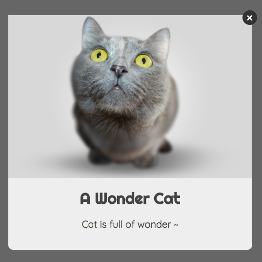
Well, after the course, I decide to build a simple JS snippet — EnlightenJS with the complete knowledge of HTML & CSS. Additionally, this project is similar to SweetAlert 2 which is also one of my favourite JS snippets. However, I wanted to create one by myself, so EnlightenJS becomes the one I build as my side project. If you view the my GitHub repo., you can see that it is a simple light-box (or alert-box, in Bootstrap, it is called “modal”) renderer which can generated with a few lines of JavaScript code.
在這課程之後我自己決定想搭配所學到的東西做出一個 JS 小插件 — EnlightenJS。此外,這個專案和 SweetAlert 2 很相似但也是我一直以來喜歡的小插件之一。然而,我會想要創造屬於自己的 SweetAlert,所以 EnlightenJS 成為了自己的一個小專題。如果你看到我在 GitHub 上的 Repo.,你可以知道這個插件可以藉由簡單的 JS 程式碼產生精美的光箱。
  Enlighten({
    title: 'A Wonder Cat',
    content: 'Cat is full of wonder ~',
    imageURL: 'URL_OF_THE_CAT_IMAGE.png'
  });
The light-box layout is taught by our mentor Amos, but how does it reflect to what I’ve learned in HTML & CSS course? Basically it’s the thought and design of the HTML structure and CSS style as the main role with some JavaScript dynamic control flow. I divided the Enlighten box into a structure which is presented below.
而這個製作光箱的版面設計也是 Amos 講師教的重頭戲之一,但這如何反映出我如何運用課程學習到的東西製作出這個動態光箱插件?基本上,重點在於 HTML 會如何去架構整個光箱以及 CSS 的樣式怎麼去搭配,而 JS 的作用僅是判斷使用者的需求(輸入)並且動態地渲染出相對應的光箱。我把這個 Enlighten 光箱的架構大致上切割成以下的結構。(或者是“彈跳小視窗”,不過這個名稱太硬了,在 Bootstrap 裡稱為 “modal”)
- Enlighten Root
  - Enlighten Box
    - Image Wrapper
      - Image
    - Header
      - CloseBtn
        (The top-right button which can close the Enlighten box)
      - Title
    - Body
      - Content | HTML | Form
    - Footer
      - ConfirmBtn
      - CancelBtn
With JavaScript, I can render the HTML elements and apply corresponding styles. In the past, I have another side project called MusiqueJS, which is also another kind of renderer that generates an MP3 player UI. It gets stuck however due to lacking CSS concept knowledges and too many codes in JavaScript which dynamically changes the CSS style in cumbersome way. (That doesn’t mean changing CSS styles via JavaScript is not a good way. It depends how you make good use of them, the statements above are just the author’s learning experiences and difficulties.)
藉由 JS ,我可以動態渲染 HTML 元素以及搭配相對應之 CSS 樣式。過往的時候,我有另一個專案名為 MusiqueJS,也是另一種渲染出樣式並且產生一個簡單的 MP3 Player 的 UI。但在途中卻卡住的原因是因為缺乏 CSS 的基本概念造成一股很龐大複雜需要動態樣式操控的 JavaScript 邏輯(甚至有些還不必要)阻礙著插件的發展。(這並不表示所有用 JavaScript 改變樣式是不好的行為,要視情況而定,這些過程敘述為作者在軟體開發上的一些經驗以及困難之處)
With the knowledges Amos taught us, I nearly reduced half of the codes (probably at least 500 lines of JS code for dynamic styles) and replaced with CSS style properties neatly in my EnlightenJS project. From this experience, it shows the importance of understanding the basics of HTML & CSS saves a lot of time and reduces a tons of logical statements in JavaScript.
將 Amos 講師的知識運用其中使得在 EnlightenJS 這個專案裡估計將近半數的 JS 程式碼(大約有 500 行以上的動態更動 CSS 樣式的程式碼)被簡潔有序的 CSS 樣式取代。從我的經驗來看,這大大的提升了開發效率並且節省了許多時間還有削減了很多冗贅的 JS 邏輯在開發插件上。
Last But Not Least …
There are too many things to share, and I am very appreciated of what I’ve experienced in 5xRuby. I am exciting about what will happen next during the internship. See you in the next article ~ XD
有太多的事情可以講了~然後我覺得在五倍紅寶石的經驗是很值得的。我期待著在實習期間下一個到來的驚喜時刻,下一篇文章見~